A Wheel That Spins Is Not Automatically Fun
What fixing a stubborn web wheel taught me about animation, anticipation, readable labels, and the difference between working code and a good interaction.
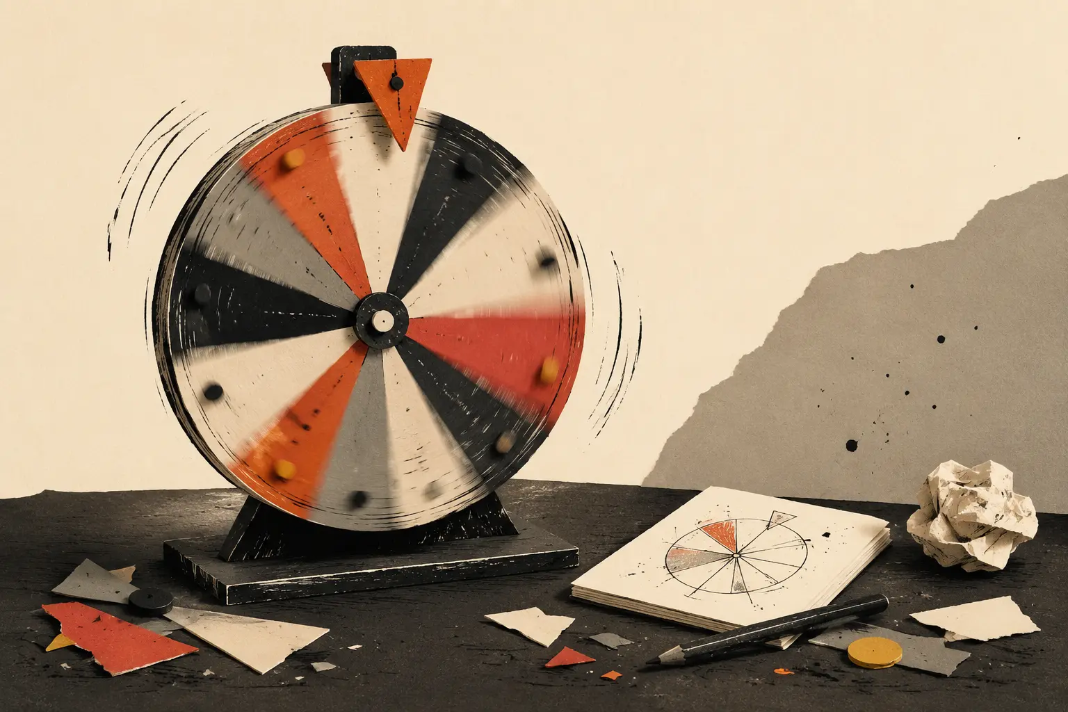
I recently worked on a wheel that had two very reasonable objections to being called a wheel:
- It did not spin.
- Its text occasionally escaped the circle.
The bug was funny for about five seconds. It was also a useful reminder that “the feature exists” and “the feature feels good” are completely different milestones.
Motion needs a job
A result could appear instantly. Technically, that is faster. But a wheel is not just a random-number interface wearing a circle—it is a tiny piece of theatre.
The spin creates anticipation. The slowing motion makes the outcome legible. The final position gives the result a physical place on the screen. Remove that sequence and you still have randomness, but you lose the reason someone chose a wheel instead of a plain button.
The trick is restraint. Too fast feels fake. Too slow becomes annoying on the third spin. The useful middle ground is long enough to build expectation and short enough that repeat use does not feel like waiting for an unskippable ad.
Geometry eventually collects its debt
Wheel labels look easy until the text changes.
Short words behave. Longer phrases stretch toward the edge, collide with neighbouring segments, or rotate into positions that are hard to read. A layout tuned around the nicest example will break the moment real content arrives.
The fix is not one magic font size. It is a system:
- calculate the available radial space;
- shorten display labels when the full value can appear in the result;
- scale within sensible minimum and maximum sizes;
- keep enough padding near the centre and outer edge;
- test the worst label, not only the average one.
Designing for the worst believable input is less glamorous than choosing colors, but it is what makes the colors worth seeing.
Test the feeling on the actual device
Desktop tools can hide weak interactions. A mouse is precise, the screen is generous, and browser developer tools make everything look under control.
On a phone, the truth arrives quickly. Is the spin button easy to reach? Does the wheel fit without shrinking into a coin? Does the result remain visible when the browser bar moves? Can you use it again without scrolling around?
I now treat these as part of the feature, not a cleanup pass.
The final lesson was simple: polish is not decoration added after a tool works. For an interactive tool, the timing, feedback, fit, and repeatability are how it works.